Friday, November 11, 2011

ESRI Shapefiles and Google Maps

This week I discovered something so neat that I just have to share. I've known for quite a while how to export KMZ files from ArcMap for use in Google Earth. This is neat, but from a public participation point of view has the downside that the person who is receiving the map must also have Google Earth installed. It is free, but individuals may be reluctant to install additional software - or unable to install additional software if their company does not give them administrative permissions on their computers. The individual must also understand how to use Google Earth, and to be quite honest it can be a bit slow to load with all the satellite imagery.

While looking at Google Earth this week, I also noticed that it was possible to export content for use in Google Maps. So I fiddled around with things until I figured out how to do it. Here's an example of a finished product (I'll give you step by step instructions in a second). The great thing about presenting maps this way is that you can just distribute a link via email to anyone you want to look at the map - and those individuals can in turn forward the email with a link to anyone (no forwarding of attachments required). Furthermore, the individual only needs to have a web browser installed on his or her machine to view the map - it is a fair bet that just about anyone with email capabilities also has a web browser. Then the recipient can zoom in and out in Google maps just as always - with the information you've sent them hovering over everything.

Creating those maps for distribution is a bit more complicated than using them, and I'd like to describe the steps here in case you'd like to do it yourself. This does require you to have ESRI's ArcMap installed, but if you have another GIS program that can export KMZ files, you can pick up the steps at that point.

Within ESRI's ArcMap version 10:
1. Add the shapefile(s) you'd like to view in Google Maps to an active map document (File --> Add Data --> Add Data...).

2. Customize the appearance of your shapefiles by right-clicking on the shapefile name in the Table of Contents panel and selecting Properties.... In the Properties window, click the Symbology tab and customize the look of your shapefile. IMPORTANT NOTE: THE FILE WILL APPEAR IN GOOGLE MAPS WITH THE SYMBOLOGY YOU SPECIFY. This means that if you display different colors for different polygons, they will be those same different colors in Google Maps, and will appear in a legend on the left pane of Google maps. This also means that if you want to be able to see the contents of Google Maps under your shapefile, you should make the interior of any polygons transparent!
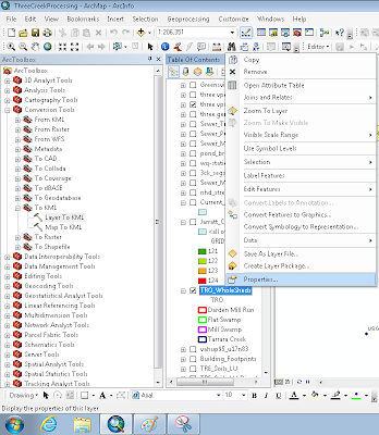
ArcMap Screenshot showing Properties and the Expanded Toolbox (next step)

3. Open ArcToolbox (Geoprocessing --> ArcToolbox) and expand the Conversion Tools heading. Expand the 'To KML' option and double click Layer To KML.

4. In the dialog that appears, under 'Layer' select the layer you want to export. Save it to a useful location you'll be able to find after saving it. Make the 'Layer Output Scale' 1.

Within Google Maps:
1. Go to maps.google.com. If you are already signed in to your Google account, great - if not, click the 'Sign In' link in the upper right corner. You MUST have a Google account of some sort in order to do this.

2. Click the My Places link in the left panel:

3. Click the red 'Create Map' button in the left panel.

4. In the fields that appear, give your map a title and description. Choose the appropriate radio button to indicate whether you want this map Public or Unlisted. Personally I like things I create to go to only my intended audience, so I usually choose Unlisted. Click the Save button if it has not already autosaved.


5. Click the Import link above the Title field.


6. In the dialog that appears, browse and find the KMZ file you exported previously from ArcMap.

7. Poof! You have a map! Click the 'Done' button at the top of the panel.

8. Now for the tricky part...there is probably an easier way to do this, but I haven't discovered it yet. To get the link to share with people, first click on the 'My Places' button at the top of the left panel. Then right-click on the map you just created and select 'Copy Shortcut' - this will copy the link to that map to your clipboard, and you can now paste it into an email or wherever else you choose.

I hope you've found this informative and as exciting as I have! Happy Mapping!

Friday, November 4, 2011

A Low Flow Conundrum - Part 2

So, building on last week's post...I'm currently dealing with a swampy area in southeastern Virginia - this is the first time I've modeled swampy/marshy areas. I took advantage of HSPF's high water table routines - new in version 12.2 of the model - to simulate these areas. Arriving at parameter values was an interesting experience, perhaps something to be discussed in a future post...a student working in the TMDL group at Virginia Tech is delving further into the sensitivity of these high water table parameters for his master's research.

One of the first oddities that struck me occurred when I generated the function tables for these watersheds. Ever since earlier research in the group demonstrated that the function table, as long as it is somewhat sound, has little effect on the overall hydrology predicted by HSPF, we have tended toward using an automated method to generate function tables based on the Natural Resources Conservation Service's hydraulic geometry curves and Digital Elevation Model (NED) information. It is preferable to gather one cross-section per modeled subwatershed, but in cases like the current one, where we have 78 subwatersheds to study, it becomes extremely costly to collect so many profiles.

So, moving forward with the NRCS data for the coastal plain region in Virginia, I noticed that the combination of bankfull depth, top width, and cross-sectional area did not yield a typical trapezoidal cross-section. Normally I use these three estimates to come up with a bottom width for the channel by assuming a trapezoidal channel geometry, but the calculations in this case yield a bottom width slightly larger than the top width. This didn't initially raise any flags for me, I made a mental note of the oddity and simply set the bottom width equal to the top width and moved on.

Unfortunately the studied streams did not have hydrology gauges, so I was unable to compare modeled hydrology with anything observed. We used a 'surrogate watershed' (that already had a TMDL completed) for which the function tables were calculated by another consulting firm (the methodology they used is not evident from the files they provided). During water quality calibration, I noticed that the streams went dry - a lot. This made no logical sense as we know the area we're studying is swampy. Further investigation showed that the free water surface evaporation from the reaches, nothing I had ever given much thought to before, was exceedingly high for the model of these watersheds. I traced the reason back to the difficulty in calculating bottom width - normally the bottom width is considerably smaller than the top width, so that while the flow is in the range of dry stream to bankfull (where it commonly stays), the surface area of the stream decreases as the water level falls, and evaporation decreases accordingly. Because I had set the bottom width equal to the top width for these swampy areas, evaporation continued at a high rate down to the last drop of water, causing the streams to go dry much faster than they should.

To solve this problem, I investigated the function tables from the surrogate watershed and adjusted ours to match their overall pattern. This involved a decrease in the surface area at near-zero flows - which makes logical sense, as when the flow is very small the water will start to move in small streams rather than spreading out across the full flat streambed. This solved the problem for 3 of the 4 study areas. In the fourth, however, it actually caused more problems. This goes back to what I mentioned previously about dealing with low flow issues - that is, setting a cutoff. When evaporation was high, the stream spent a considerable fraction of its time beneath the cutoff stages used for livestock and wildlife. That is, their contributions were removed from the stream a considerable amount of the time. When evaporation was set at a more reasonable level, the stream spent much more time above the cutoff, causing higher contributions from livestock and wildlife and thus increasing the various statistics we use to evaluate water quality calibrations.

This is a very interesting conundrum. Typically increasing flow (done in this case by decreasing evaporation) causes a decrease in bacteria concentrations (the old axiom "the solution to pollution is dilution" - outdated as we know it to be - comes to mind). This is the first time I've seen it actually INCREASE bacteria concentrations - and it is of course due to the way we use the stage cutoff to represent behavioral changes in animals.

I have used the neighboring watersheds as guides to help me set some reasonable parameters for this troublesome watershed. I am finishing up the modeling now and we'll see how well things go!Link